

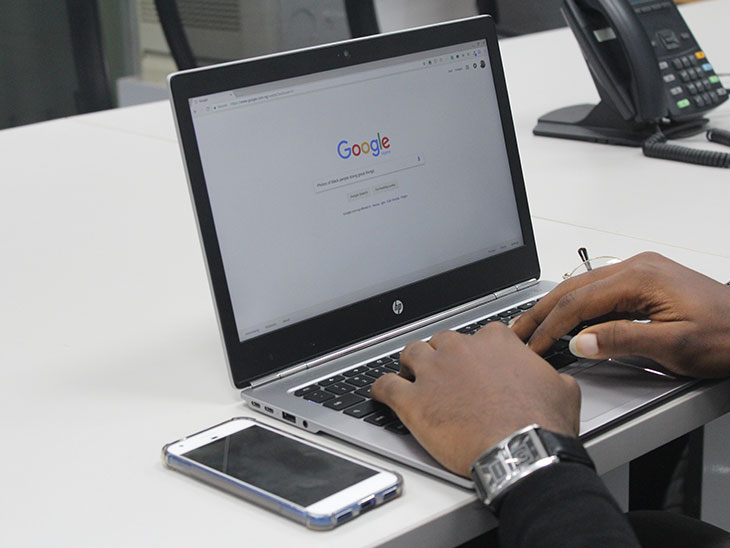
Technology and innovation have transformed the lifestyle of people. Tech-savvy people consider mobiles as their workstation. Mobiles are easy to carry and provide convenient access to the internet as and when required. In the present scenario, websites need to be functional on all modern devices, particularly mobile phones. Google is very stringent on the issues concerning the mobile usability of websites. Sites that do not provide a pleasant experience to mobile users are ranked low by Google search algorithms and policies.
Google had declared its policies to site owners. It had made an official announcement that the Google search console would consider the mobile-friendliness of a website as an essential aspect in determining the rank of the site, w.e.f. 21st April 2015.
You can quickly check whether your site has cleared the benchmark required to qualify as ‘mobile-friendly.’ All you need to do is :
- Login to Google Webmaster Tools account
- Click through the section of ‘Search Traffic> Mobile usability.’
How is Google search Console helpful?
- Google Search Console or Google Webmaster Tools provides a medium of communication between Google and the website admins, or more aptly, the ‘webmasters.’
- Google Search Console helps report issues concerning your website.
- Google Search Console also keeps refurbishing you with any kind of malicious software attacking your website.
- You do not have to pay for it as it is available free of cost.
It is a harrowing experience for users to open a website that has an improper display- a text too small or running out of the screen, plugins that are incompatible or viewport not set appropriately. So, Google Search Console deals with mainly six types of errors:
- Text not fitting in the screen space.
- Clickable elements all cramped up together.
- Small text that’s difficult to read.
- Incompatible plugins
- Viewport not set correctly.
- Viewport not set as per the width of the device.
How to fix the issues
1. Issue of text wider than the width of the screen
This error occurs when Google Boots crawls a site and reports the issue ‘Content wider than screen.’
‘Content wider than screen’ is a CSS error. Often CSS error arises when images are optimized for a specific resolution or images and text are set to ‘absolute value.’ This error can be rectified by resetting the values to ‘relative’ and positive numbers while declaring CSS.
2. Issue of clickable elements all cramped together
What’s the issue with clickable elements stacked up together?
You end up clicking something else while trying to click something because there is hardly enough space between two elements.
This can be quite antagonizing! Space should be appropriately managed while designing websites and placing web elements on a web page.
Viewport should also respond to all modern devices where your site will be accessed from.
HTML websites should have an initial viewport scale set to 1.0. For WordPress sites, you should select responsive themes and plugins.
3. Issue of undersized text
Users often find it difficult to read the text of a website on mobile devices because of small font sizes. Google Search Console reports the issue of small text as a CSS error. This error can exist in the viewport.
The error can be rectified by setting the viewport to a proper scale. You also need to set the font value to’ relative’ and the minimum font width as 575 px.
4. Issue of Incompatible plugins
Google Search Console reports this error for pages that are incompatible for viewing on mobile. Care should be taken to upgrade any old version of HTML into HTML5. Plugins should be updated regularly. Plugins that are not mobile-friendly should be uninstalled.
5. Issue of Viewport not set properly
The viewport plays a vital role in the responsiveness of websites. It is the viewport that makes webpages scale according to the device used for viewing. Viewport changes its size with the size of the device–smaller for mobile devices and larger for laptops and desktops.
Pages of HTML5 website should be edited to include viewport meta tag in the header section, to resolve the issues concerning viewport.
<head>
<meta name=”viewport” content=”width=device-width, initial-scale=1″>
</head>
Now let us know each part of the viewport tag:
<meta> -It contains instructions for the browser for scaling the dimensions of the page.
width=device-width- This part of the tag sets the page width in accordance with the screen of the device used.
initial-scale=1.0 – This part of the viewport tag sets the initial zoom as 1 for pages viewed on a browser.
6. Viewport not set per the width of the device.
This type of an error report is generated by the Google search console when the header section contains the viewport tag, but the width=device-width and initial-scale=1.0 portion of the tag is left out. Excluding this part makes the viewport nonresponsive to other devices.
Mobile usability tester is a tool that lets you check how the page looks on a mobile device.
Validating your site for errors
Google recrawls the webpages that have been fixed. When all instances of an issue have been resolved, the status table is marked as fixed.
If you are facing mobile usability issues or have questions about mobile usability, please mail us or give us a call. We love to hear from our visitors!


