

3DCart supports a lot of responsive sliders out of the box. All these responsive sliders automatically resize the banners to fit the device width. However, this does not work well with all the images. There are situations where we want to display portrait banners in case of mobile phones and landscapes in case of desktops. This post explains how to add custom sliders for mobile phones in 3Dcart. You will be able to use two different sets of banners, portrait ones for mobiles and landscape for desktops.
Let’s get started!
First, we’ll need to find the sliders or banners code. To do this:
- Log into your 3dcart Online Store Manager
- Using the left hand navigation menu, go to Settings > Design > Click Themes & Styles
- Then, on the top right click on more dropdown button
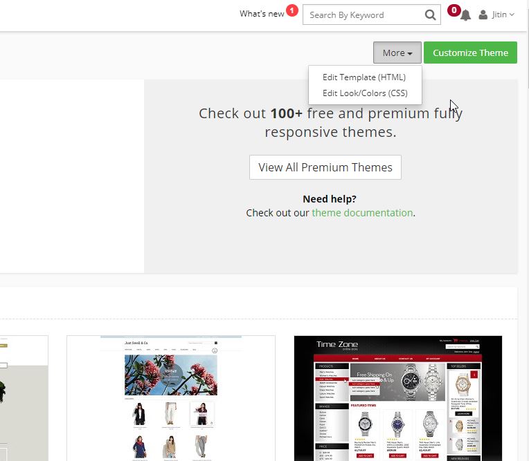
- Click edit template(HTML) and when the file manager loads then find the home.html file.
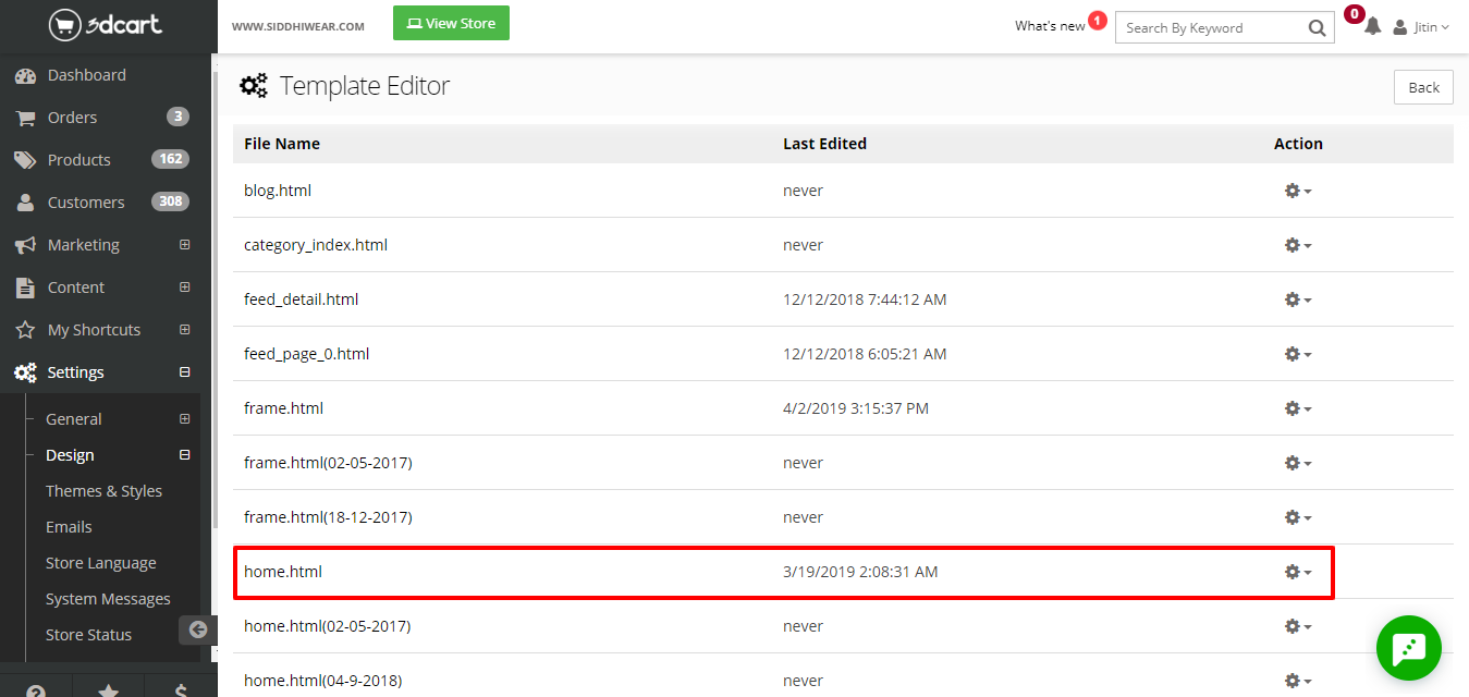
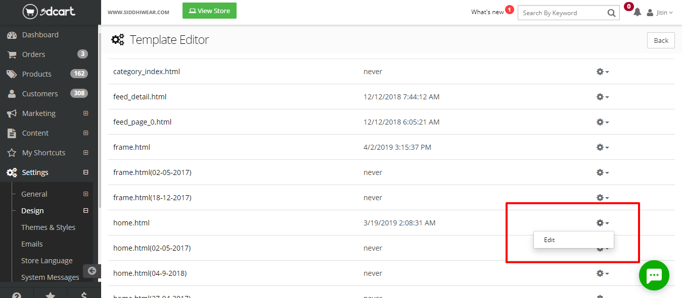
- Go to the dropdown icon on the top right and click edit home.html file.
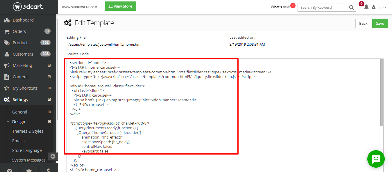
Search home carousel module code which is used for desktop carousel as shown in the screenshot below:
| <!–START: home_carousel–>
<link rel=”stylesheet” href=”/assets/templates/common-html5/css/flexslider.css” type=”text/css” media=”screen” />
<script type=”text/javascript” src=”/assets/templates/common-html5/js/jquery.flexslider-min.js”></script>
|
The above highlighted code includes slider css and javascript embed code which must be added at top of home.html page.
| <div id=”homeCarousel” class=”flexslider”>
<ul class=”slides”> <!–START: carousel–> <li><a href=”[link]”><img src=”[image]” alt=” banner” /></a></li> <!–END: carousel–> </ul> </div>
|
The above-highlighted code contains a main <div> element which is the boundary of the slider. The images within <li></li> are managed from the home-carousel module in backend. Add images in the module and then <li></li> elements will be repeated for all the images added in the module.
| <script type=”text/javascript” charset=”utf-8″>
jQuery(document).ready(function () { jQuery(‘#homeCarousel’).flexslider({ animation: “slide”, slideshowSpeed: 1000, controlNav: false, keyboard: false }); }); </script> <!–END: home_carousel–>
|
The above mentioned jquery script code adds some extra options to the slider which make slider more attractive. You can find all the options related to flexslider by visiting the following link.
https://github.com/woocommerce/FlexSlider/wiki/FlexSlider-Properties
We hope you enjoyed the article. In case you want to add or discuss something feel free to write to us.
Below is the code to display custom slider for mobile devices
| <div id=”mobilehomeCarousel” class=”flexslider” style= ‘display :none ;’>
<ul class=”slides”> <li><a href=”[link]”><img src=”[complete image 1 path]” alt=”Banner image” /></a></li> <li><a href=”[link]”><img src=”[complete image 2 path]” alt=” Banner image” /></a></li> <li><a href=”[link]”><img src=”[complete image 3 path]” alt=” Banner image” /></a></li> </ul> </div> |
Below is an example of complete image path :
Complete image path = ‘http://example.com/assets/images/myimage.jpg’
The above highlighted code contains a main <div> element which is the boundary of the slider, next comes the slides with the list of images which will be displayed in the slider. As you can see the <li></li> element is repeating, it is because the <li> element is having the link (to which user will be redirected when clicked on the image) and the image.
| <script type=”text/javascript” charset=”utf-8″>
jQuery(document).ready(function () { jQuery(‘#mobilehomeCarousel).flexslider({ animation: “slide”, slideshowSpeed: 1000, controlNav: false, keyboard: false }); }); </script>
|
The above mentioned jquery script code adds some extra options to the slider which make slider more attractive. You can find all the options related to flexslider by visiting the following link.
https://github.com/woocommerce/FlexSlider/wiki/FlexSlider-Properties
After adding the script and element you need to add one more script to display slider for mobile devices.
| <script>
jQuery(document).ready(function(e) { if(jQuery(window).width() < 768) { jQuery(‘#homeCarousel’).remove(); jQuery(‘#mobilehomeCarousel’).css(‘display’,’block’); } }); </script>
|
The above mentioned jquery script code will work only for the mobile devices i.e. the above code will remove the desktop slider while accessing on mobile devices and will display the mobile custom slider.
Hence you will be able to view a good and attractive slider on your website page.
Important Note: The desktop images must be of equal height and width so that the webpage looks great. Follow the same important note for mobile slider also.


