

If you ever experienced fun visiting a website, it is suggestive of a thoughtful and sophisticated design process behind it. User Experience is about what, when, where, why, how, and who uses the product. Once we have understood the users’ needs and wants, we can design an excellent solution for them.
We will guide you through the tips and strategies that will help your business achieve a great user experience and boost SEO:
1. Check and optimize your site speed
The delay in loading a web page accounts to 75% of the experience from users. All other metrics have a lesser impact on the page loading speed of the device being used.
How does page speed impact business?
As the time to load the site takes from two to three seconds, the probability of a bounce increases to 32%. However, if it takes more than that, this probability reaches more than 90%.. Google considers page speed as one of the 200 ranking factors that influence a website’s position in organic search results, and it also affects UX.
Tips to speed up your site
- Start with choosing a performance-optimized hosting solution. The hosting quality is one of the most critical factors for your page speed. A hosting service that is optimized for your needs is a must.
- Deactivate and delete unnecessary plugins.
- Everyone likes to have crisp and high-quality images on their website, but they also slow down the sites. Many WordPress users are unaware that having high-resolution images can impact their site speed. You can use the plugin Smush or Imagify to compress those images automatically without reducing much quality.
- Reduce the number of redirects. Every time a page redirects to somewhere else, it prolongs the HTTP request and response. In some cases, redirects may be necessary, but unnecessary redirects should be avoided.
- Cache your web pages. Caching stores static copies of your website file. Hence it has to download just one copy of the cache versus the million other things that it has to do. This speeds up your website since the server has to do few things. There are many ways you can set up caching with your website. You can employ a plugin such as WP speed and Total Cache.
- Monitoring performance over time is essential whether you are doing an eCommerce business, a blog, or a portfolio online. You can use a performance monitoring tool to keep an eye on things for you. When a slowdown strikes, it notifies you, and you can take corrective measures.
These tweaks can help shave off a couple of milliseconds here and there.
2. Ensure that your website is responsive and mobile-friendly
Before launching your website, make sure it looks good on desktop and mobile. This is because so many people consume the internet on their mobile phones, which makes it super important to make your site mobile-friendly.
Making a responsive website means designing it to let the layout change based on the screen size you are viewing it from. Web browsers can detect if you are looking at a website from a laptop, phone, or tablet. With the proper coding, they can display items that are easier to see and use, optimized for that device. This also helps with SEO as search engines look for and index higher flexibility. In today’s era of modern technology, many websites have built-in mobile responsiveness. They have to configure it, and that makes it look pretty.
- Prioritize your content to make your site mobile-friendly. Time is the most precious resource. When the process of searching information is too complicated, there is a risk that people might leave your site. When someone goes, it is tough to get them back. This is especially true with mobiles. Hence, the way you present content on your site is very critical.
Try the following
- Improve the microcopy on your pages. These are short sentences or words that are highly contextual and targeted to help users do things.
- Leverage progressive disclosure. Our brains can only process limited information at one time when trying to accomplish something, like searching for something or deciding what product to buy. Progressive disclosure is a design pattern that helps maintain focus and removes distractions when trying to accomplish something. The key concept is to show your most important information at the top and present additional information when the user needs or asks for it.
- Use large size fonts and buttons. Small screens equal hard-to-read small fonts. It is a good idea to use at least size 14 pixels or larger when designing for mobiles. Ideally, you should use a standard web font so your user doesn’t have to download more custom fonts when loading your site. Similarly, small buttons are hard to push with the finger. It is best to keep your buttons large and give them some extra spacing.
- Run your site on several mobile devices and tablets to feel it out.
- Keep your website simple. Do not complicate things and boil down your page to the most essential items.

3. Maintain consistency throughout the site
With so many websites that all have different designs and elements, It is essential to have a consistent web design for navigation, buttons, copy, and headers. With consistent layouts, you can build trust and enhance User experience. A layout that flows easily and moves users throughout the website is always highly desired. Also, design elements can help the conversion rate of your website.
- Stick with the same font, colors, and messaging throughout your website, social media, and branding collateral. This will help maintain your brand and become recognizable. Your visitor will consciously or subconsciously begin to understand and comprehend your messaging Because it will get familiar with them.
- Stick with a theme or promotion and repeat messages many more times than you think necessary and provide the same information in multiple ways.
Have you ever been unsure of where to click to get to the page content that you are looking for? It takes about 50 seconds for users to form an opinion about your website. This determines whether they like your site or they despise it. Websites are prone to an extreme level of snap judgment that immediately influences perceptions of credibility. In addition to being a normal functioning website, an Intuitive and well laid out navigation structure can help increase search engine rankings.
Focus on your homepage. Your homepage needs to improve its site navigation.
Best practices to improve site navigation are:
- Start with the sitemap. A sitemap is a list of pages on your website. It outlines your pages by starting with primary categories and themes and then defining the pages within those main ideas. Use that site map to determine which primary navigation Items you need across your main navigation footer and all the sub-items underneath it.
- Cater to the needs and wants of visitors. You want visitors to land on your site and quickly find the information they are looking for. What’s going to be valuable and relevant for them? What are the pages that every user wants to see? Make sure that those pages are front and center of your website.
- Make sure you use short descriptive titles. Long menu titles can clutter the navigation and make your website look messy on mobile.
- Keep the number of menu items in the top navigation minimum. People scan websites to find quickly what they need, and you have to simplify that.
5. Use white space
White space is a fundamental aspect of an excellent website design, as it increases comprehension by 20%.
White space is the area between individual design elements, including typography glyphs of readable characters. Although it is named whitespace, it doesn’t have to be white. White space can be of any color, texture, or pattern. There are two different types of whitespace.
Macro white space- This is the large space between major design elements.
Micro white space- This is the small space between the design elements. You can find it in between lines and paragraphs. Micromax space has a direct impact on legibility.
Macro best practices
- Consider the branding or the messaging you are displaying when using white space.
- Make sure that the CTA is prioritized.
- Don’t just use white
Micro best practices
- Follow a Spacing system(ex 8 px or10 px)
- Follow spacing patterns whenever you have many elements.
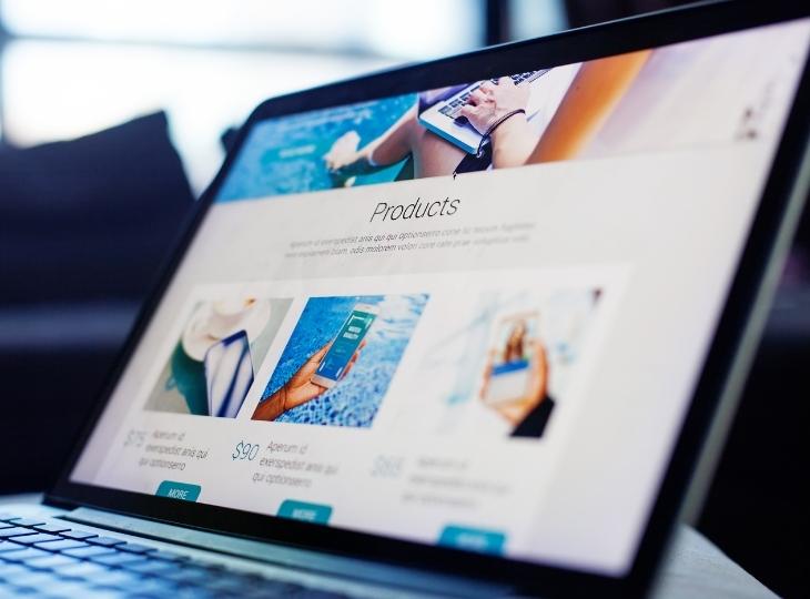
6. Use Images wisely
Images have outgrown the use of books and magazines and have become an integral part of a website design. Today images are a creative medium to identify and communicate the brand message and transmit ideas through just one or several images. Employ illustrations to express emotions and brand value.
- Illustrations have the ability to make the UI more informative. Words are not always enough when it comes to describing concepts. Images have the power to make pictures more precise and compelling. This is why brands use images to clarify ideas behind the marketing campaigns and provide more brand-related information. Using plain text without imagery is a terrible choice for websites.
- Images motivate users to take action. Brands also use images to communicate their brand message.
- Custom illustrations for a brand can help it stand out from the competition.
- Using mascots is another way to make your product or service stand apart from the competition. The Mascot gives character and life to a product. It helps users connect with the product and create a memorable User experience.

7. Use an irresistible call to action.
A call to action is merely a button or a small sentence, but that doesn’t mean that it is less important. When creating your CTA, you need to define the goal of the message.
- Do you want to capture leads?
- Do you want more customers?
- Do you want more viewers on your website?
Whatever your goal is, your CTA should always support it.
Best practices of writing CTA
- The color of your CTA should always stand apart from the background it appears on. If you choose colors that are similar to the background, you will not read the text.
- Always use the same font throughout your website. Consistency shows expertise and control.
- Size does matter. Your headlines should always be more significant than the rest of your text, but they should not get out of proportion.
- Use a different color for your CTA to make it stand out.
- Don’t just write, subscribe or sign up. Be creative when writing your CTA because people will notice you this way. One way is to use humor because humor is enticing and draws attention. However, if you use humor, you should ensure that it is relevant to your business.
- A powerful CTA is short and precise. A straightforward sentence can easily do the trick.
- When writing your CTA, it is essential to tell your customers what to expect when clicking the button.
8. Take minimal information for sign up.
Asking users to create a signup form is asking them for a favor. Remember that every password and item of personal data that you store carries a privacy data debt. If you need to save information for a user between navigation and browsing session, use client-side storage instead of forcing users to create an account. For shopping sites, forcing users to create an account to make a purchase has been cited as one of the significant reasons for Shopping Cart abandonment.
If you must get users to sign up, make it as quick and easy as possible.
9. Keep your essential information to bullet points.
Bullet points help us to organize information. It makes it easier to read and highlight important information and keep writing concise.
Bullet points condense your information and make it easier to scan for the users.
10. Avoid page not found errors(404’s)
An error 404 is a page not found error and is not suitable for your website. It means that the client or the customer or whoever is there on the website can communicate with the webserver, but the webserver cannot find that particular page. In the earlier days back in the 90s, the website displayed a white blank screen saying “Page not found.” However, nowadays, using WordPress 404 pages can make it less user-unfriendly by designing more creative 404 pages.
According to research by Microsoft, the average attention span of a viewer is less than that of a Goldfish. As a result, they get distracted very easily. What does this mean for your business? It would help if you had cutting-edge user design principles to create an engaging website that can capture your audience and convert them to leads.

